Jump to content
Posted

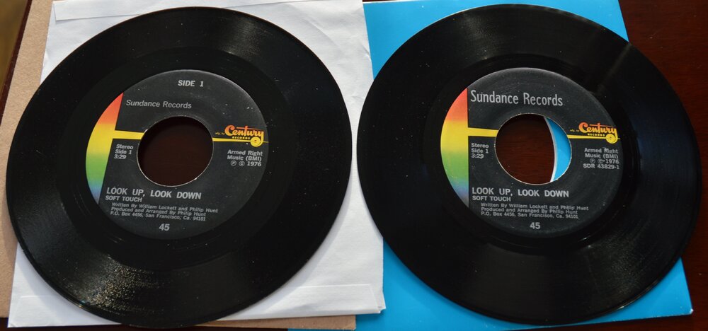
I've just realised that there are 2 different label designs (different font) on this. Does anyone have any ideas why this should be given that it's not that common.

One was sold recently on ebay (same as 1st pic below) and the seller said:-

Soft Touch: Plenty of Action 7" 45 from 1976. On Sundance Century Records. This my personal copy I have had for the last 40 years. They were not sold in stores, you had to know someone who knew the band or got it for promotion. Back side or side 1 is "Look up, look down". 
 
The ebay sales on Popsike show that this design is more common - 75/25 split.
 
Discogs shows one other release on the this label (The Diabolics) and has the design shown on the second pic below. There are only 4 sales of this on Popsike and they all have this 2nd design.
 
DSC_0001.JPG
 
 
  • Replies 1
  • Views 2k
  • Created
  • Last Reply

Most active in this topic

Most Popular Posts

  • John Benson
    John Benson

    Just a guess, but I'd say it's just a different pressing plant that did them. It's not uncommon for things like this to happen. I imagine in those days it was more a case of a telephone call or a

Posted Images

Featured Replies

Just a guess, but I'd say it's just a different pressing plant that did them.

It's not uncommon for things like this to happen. I imagine in those days it was more a case of a telephone call or an information sheet telling the type setter what to print on the label and maybe not always telling them exactly where to put it all - as long as it's on there somewhere.

Maybe someone else can elaborate on this theory?

Get involved with Soul Source