Jump to content
Major Upgrade - 12 May +
  •  
Posted

Hi Guys

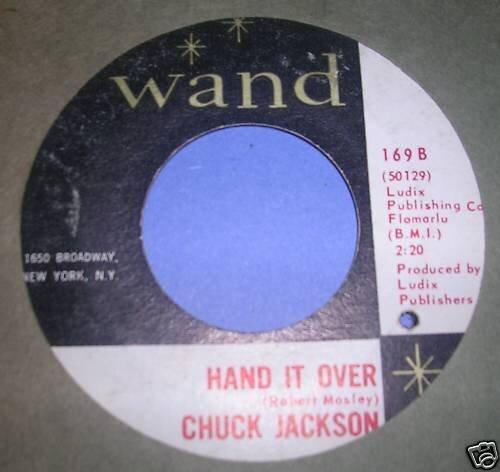
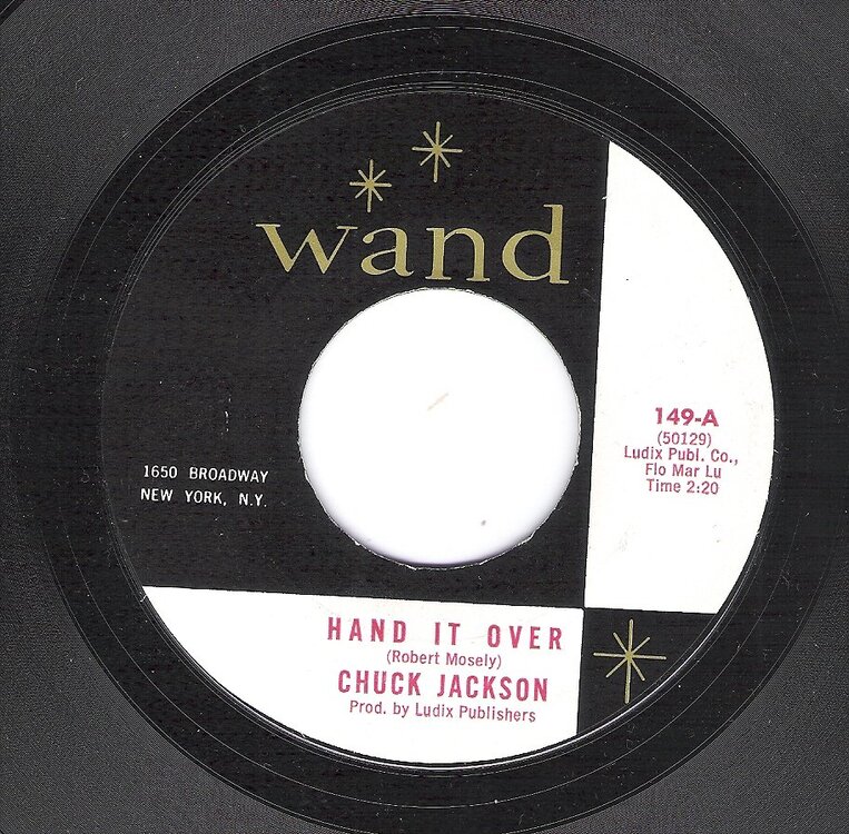
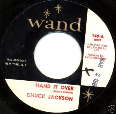
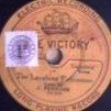
What was the label design for the first release.

Wand black and white, all lettering black and white, or Wand black and white, gold Wand lettering and red lettering on title and artists.

Dave

  • Replies 11
  • Views 2.4k
  • Created
  • Last Reply

Most active in this topic

Posted Images

Featured Replies

Mine has smaller writing?

Psmile.gif

post-9683-12583792695202_thumb.jpg

Your copy is on styrene.

The scan above is from a vinyl copy.

Yes, but how much later than the Vinyl?

P:smile:

Yes, but how much later than the Vinyl?

Probably pressed the same day (or at least same week) but at different pressing plants.

Probably pressed the same day (or at least same week) but at different pressing plants.

thumbsup.gif

  • Author

My copy is a little like this but its a B side and is 169 different version unsure.gif

So what the story with the 169 version anyone, I've got a copy as well. It just belts along, love it. As you say, Hand it over is athe B side.

Dave

David Flynn's Anoraks Corner

wand logo 149 HAND IT OVER/LOOK OVER YOUR SHOULDER

169 SINCE I DONT HAVE YOU/HAND IT OVER

SEEMS TO BE A LATER ISSUE

RICKY.

post-4723-12584684939398_thumb.jpg

it was issued as an `A` side and made no92 on usa pop charts in april 1964. the flip is look over your shoulder. then it was issued as `B` side of since i dont have you and made no 47 pop in december 1964. all original issues are the scans above black & white labels with red text atho some look a little different coz they were made at different pressing plants

dave

Get involved with Soul Source