- Replies 64
- Views 10.4k
- Created
- Last Reply
Most active in this topic
-
45cellar 26 posts
-
Harry Crosby 5 posts
-
De-to 3 posts
A better way to browse. Learn more.
A full-screen app on your home screen with push notifications, badges and more.

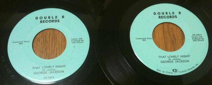


I am always Intrigued by the different Label Variations.
The thing that stands out with many Titles, is just that, the Title.
One Line, Two Lines, Sometimes Three etc & Different Size Font for the same Release.
Considering the Quality Control aspect, did the Label Owners care beyond their Individual Logo.
Picked this one purely as an example of many, Just happened to be a Brunswick Label.
Here's a DEMO for this release, Is this a clue as to first off the press
with above Stock Copies, or Just a coincidence.
Edited by 45cellar