Jump to content
Posted

OK, Dayo did a cracking thread with 'Cool' label designs.

I'm gonna spin that one now and I want to see what you think are the SHITTEST labels ever.

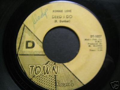
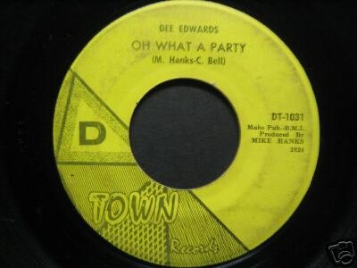
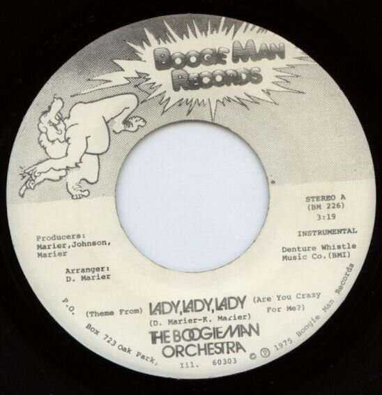
For sheer tin-pot design, penny-pinching and least thought has to this (How did they manage to keep the type writer straight?? - OK, I know it's an 'Indie' label & they didn't have much cash, but you know what I mean!!!)

post-1261-1100161917_thumb.jpg

And I know it's not 'Soul', but it is 70's/Northern, before anyone starts!!!

Jamie

  • Replies 23
  • Views 2.1k
  • Created
  • Last Reply

Most active in this topic

Posted Images

Featured Replies

What about Jay Walking - the red label logo looks like it was taken from a third generation photocopy.

Although it does have a certain primitive charm! (says our art correspondent)

Four Vandals??

I'll get my coat :P

Scans please?

There's an early version of one label, it might be "IN", where it's actually hand drawn!

Didn't you have a hand drawn Liberty Bell label once, Pete?

Is that Cliff "Big on God (BOG)" Richards on your avatar? Please explain yourself. The evangelists haven't been knocking on your door again have they?

Edited by Stuart T

I think this must get a prize for crap effort. If you are half blind and pissed you might just accept the squigal drawing of a marine mammal is a whale not a dolphin. The sea is topped with barbed wire and the tide in on one side and out on the other. The lettering is all over the shop and the hyphen & ? are missing. But apart from that.............

Didn't you have a hand drawn Liberty Bell label once, Pete?

Is that Cliff "Big on God (BOG)" Richards on your avatar?  Please explain yourself.  The evangelists haven't been knocking on your door again have they?

link

I decided to change my avatar every few hours to keep you on your toes :P

I see that you've had a nose job and grown your hair since I last saw you. you're so vain.

I think this must get a prize for crap effort. If you are half blind and pissed you might just accept  the squigal drawing of a marine mammal is a whale not a dolphin. The sea is topped with barbed wire and the tide in on one side and out on the other. The lettering is all over the shop and the hyphen & ? are missing. But apart from that.............

link

I didn't think it was barbed wire, but rather a tuna net for the cute little dolphin to get caught up in? Thats why I sold my copy.

But what a forkin TUNE !!!

I think this must get a prize for crap effort. If you are half blind and pissed you might just accept  the squigal drawing of a marine mammal is a whale not a dolphin. The sea is topped with barbed wire and the tide in on one side and out on the other. The lettering is all over the shop and the hyphen & ? are missing. But apart from that.............

link

The "dolphin" has clearly gone green cos it's dead - it's not barbed wire - it's them pesky fishermen's tuna nets that have snared the said dolphin, turned it green and bloated it to the size of its larger mammal cousin. This was clearly an environmentally friendly pressure group's (forerunner to Greenpeace) first release to raise money for this worthwhile clause....

I'll take my happy pills now.... :D

Where is the 'just for reseach' harpoon??

That song to me screams Yate Yate Yate, Wheelrights, Yate Yate ate, Roundabout, Yate Yate Yate.

Go any spare pills Rich :D

There's an early version of one label, it might be "IN", where it's actually hand drawn!

link

Eddie Foster "Closer Together" on Ocampo?

I always thought Strider was pretty rubbish. Not least because 'What' it's a bad version of a better, more passionate, record, but rather I've still never known what the hell the 'artist' was thinking! It's abstract. It's a 'strider'. It's effortless. And not in a good way.

As much as I love the record immensely (How Can I Tell...), I always thought that the Lovelite label with Patti and Jo on was terrible. What a great way to sell a record. Put three (halftoned) women on the label, one of whom looks like an anorexic zombie, another nothing short of James Brown in drag. Dammit, they had great voices tho. They should have stayed on Lock! The second label design is sublime. Where did they find that blue?! It doesn't even exist anymore! Only in a Pantone colour swatch.

There's an early version of one label, it might be "IN", where it's actually hand drawn!

link

Weren't the old 'D-Town' labels hand sketched? Sure the Precisions had one on there + others.

Haven't got a scan though......

Jamie

I always thought Strider was pretty rubbish. Not least because 'What' it's a bad version of a better, more passionate, record, but rather I've still never known what the hell the 'artist' was thinking! It's abstract. It's a 'strider'. It's effortless. And not in a good way.

1) Whatever anyone says about it being 'pop', What is brillaint

2) It's supposed to be a take off of Ichabod Crane I believe

1) Agree. 'What' is a brilliant record IMO

2) Didn't know that Pete. Always wondered if it was anything to do with the character from the Hobbit.

Following on from the D-Town thingy, here's few I borrowed off 'The Bay' laugh.gif

post-1261-1100787061_thumb.jpg

post-1261-1100787082_thumb.jpg

post-1261-1100787028_thumb.jpg

No taking it away from Mike Hanks, but surely his young daughter should not have been used for 'colouring-in' purposes, I mean, she goes over the lines and everything.

J

Hi Jamie

How did you manage to get C montgomery Burns under your Avatar instead of the usual rating?

laugh.gif

Hi Jamie

How did you manage to get C montgomery Burns under your Avatar instead of the usual rating?

:D

link

What's it worth??? laugh.gif

What's it worth??? laugh.gif

link

Is it worth me keeping those pics of you, Smithers and the Marmite under wraps Monty, Mmm?? :D:D :diablo:

Get involved with Soul Source

Advert via Google