- Replies 27
- Views 2.5k
- Created
- Last Reply
Most active in this topic
-
Corbett80 4 posts
-
Davetay 3 posts
-
grant 2 posts
-
The Tempest 2 posts
A better way to browse. Learn more.
A full-screen app on your home screen with push notifications, badges and more.

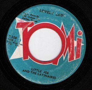


Always liked the bright colours and the way the T hangs off the end , Ill get my coat !!!
Edited by 123-motown