- Replies 58
- Views 5.6k
- Created
- Last Reply
Most active in this topic
-
Craig W 6 posts
-
Dayo 4 posts
-
MarkWhiteley 3 posts
-
Pete S 2 posts
A better way to browse. Learn more.
A full-screen app on your home screen with push notifications, badges and more.


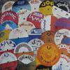
Surely there has never been a label design more cool, more evocative, than the original US Motown label design?
From the first "import" I ever bought (Tammi Terrell, This Old Heart Of Mine), to the present day, a glimpse of this label make my heart beat just a tad faster.
Case closed?